

Designing Smart LCD SCREEN
In this 3 week contract role, I designed a smart oven interface that balances analog comfort with digital interface. Simplicity and ease of use guided every decision.
I was the sole designer on the project, owning the work end-to-end from concept through handoff. I delivered production-ready designs that were grounded in real engineering constraints and ready for development.
Java Electronics Co.
Product Designer
Project Client
My Role
Technologies
Smart Home Appliance
IOT
Manufacture
Figma
overview
Business Goals
Faster Engineering Implementation
Features are optimized for simplicity
Reduce Development Risk
minimize ambiguity during handoff and prevented production delays.
Cleaner User Experience = Lower Support Costs
special features need to be intuitive
This project aimed to standardize and modernize the oven’s LCD interface (800×480) while ensuring engineering efficiency and manufacturing scalability. The goals were to:
Create a clean, simplified function selection page without decorative icons to reduce visual noise and improve clarity.
Support flexible system settings (self-clean mode, 12/24-hour time format, °F/°C) to accommodate different regional markets.
Deliver fully developer-ready assets, including vector files compatible with AI and CorelDraw (2018 or earlier).
Separate static UI elements from dynamic content (numbers and runtime states), allowing engineers to programmatically control all variable data.
overview
From function to experience
I audited the features and functionality on the spec sheet, then reorganized them to create a more coherent structure.
The functionality itself were fairly standardized, my goal here is to introduce a logical and comfortable user flow, choosing the optimal components for a streamlined experience on the LCD interface.

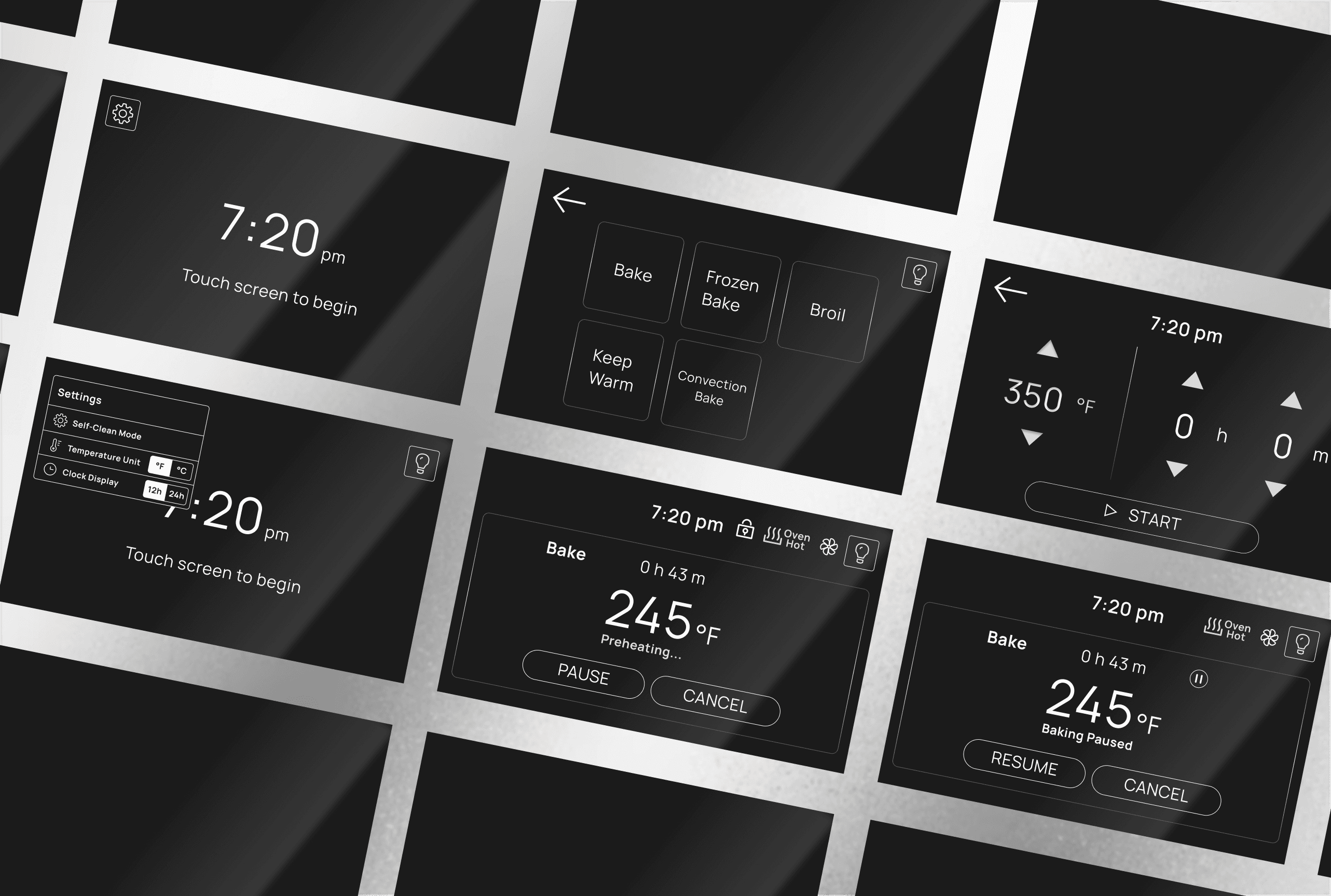
display diagram as shown from engineering side
7:20 pm
Touch screen to begin
245 °F
Bake
0 h 43 m
Preheating...
PAUSE
CANCEL
Oven
Hot
7:20 pm
Design solution
Picker or arrows?
This question came up when I was deciding the temperature and time picker.
I want to prioritize user familiarity by leveraging interaction patterns similar to Apple’s time picker. Referencing widely used UI components and gestures from smart devices, users can adjust cooking parameters through intuitive swipe and scroll interactions rather than static directional arrows.
Constraints
Although both the product manager and engineers agreed that the picker offered a stronger user experience, arrows were ultimately selected due to their ease of implementation and lower development complexity.
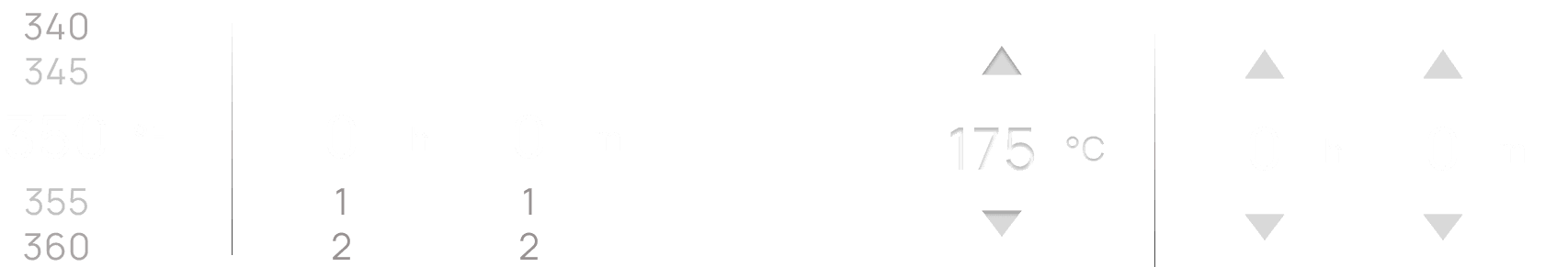
Picker selection
Arrows selection
overview
Designing with affordances

I designed the interface to visually parallel a physical freestanding oven. The main display is framed as a square, echoing the glass window of an oven door.
The icons draw from familiar oven features, such as convection fan and oven light.
overview
Accessibility and Target size - with good old pen & paper?
To prevent "rage taps" and ensure usability.
While most touch screen buttons have a physical size of 7-10mm
Which accounts for the average human fingertip. While standard
But 10-12mm provides better accessibility, especially for older users.
5 Inch
overview
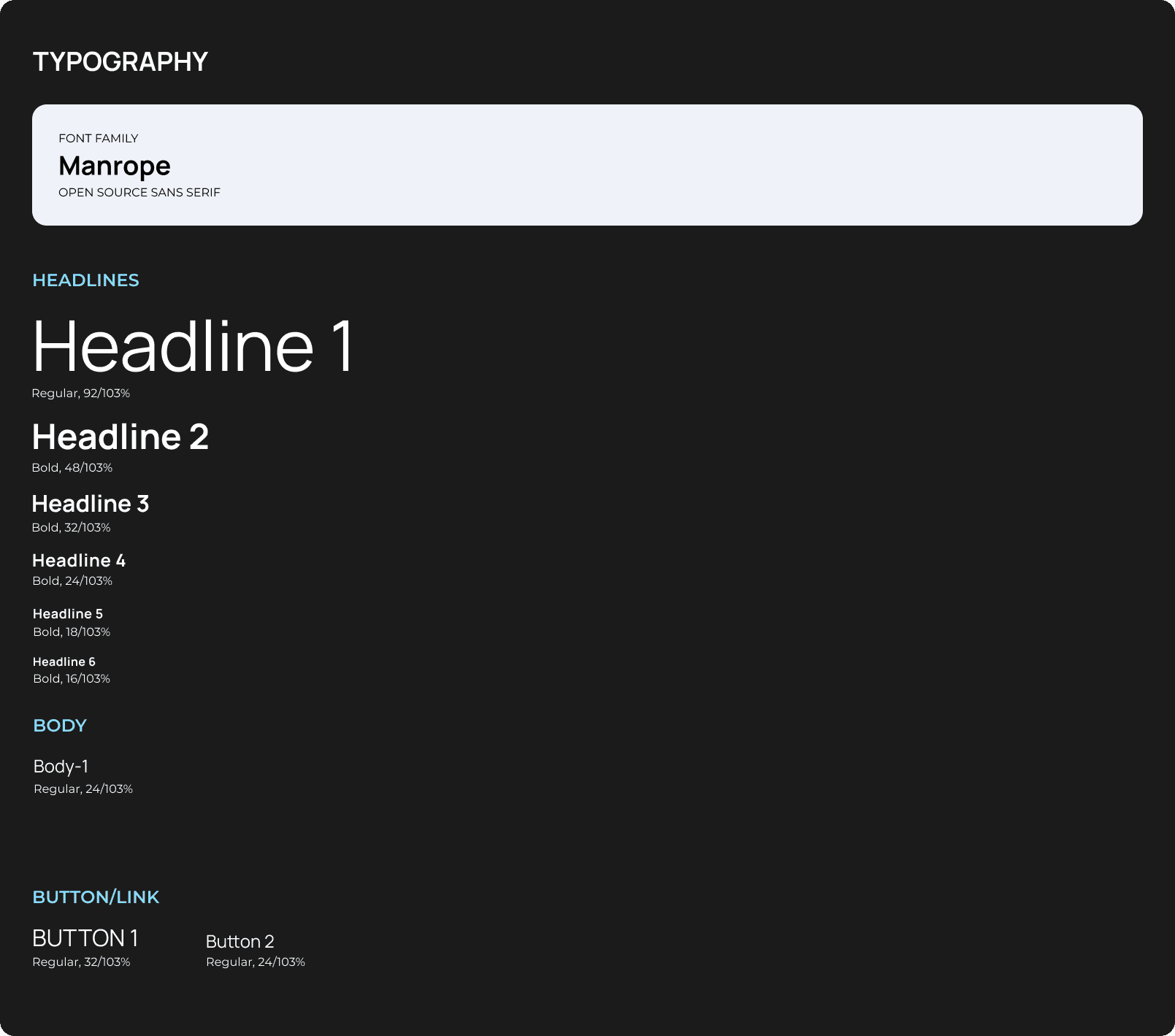
Typography
dbaahwdbhakbdbdbsadcknksnjzkjbkzdbckbsbksbdckbsdbcbsdcbzskhcbhdsbchkdbshckbdshkcbszcbhsdbckdhsbckbskhsbdkhcbskhdcbkhzsbczbhcbsdkcbhdzbckhbdskcbdzbcdhbckzbdzbcdksbckzhbckhsbdk
reflection
Final thoughts & future opportunity
I really wanted to run A/B testing on a larger scale
Here are some of them!
Information Sharing
I didn’t get the chance to explore how our prototype could create easier internal communication and streamline information/document sharing between managers and dispatchers.
Repair Shop Integration
Though users generally indicated interest in an integration with repair shop information, the complexity of actual use case is one of the major reasons it didnt make it to the cut

Export
Allowing fleet managers to export case information directly to insurance portals and other third-party applications is an opportunity to extend the product’s value beyond the platform itself

01
Strategy
project kickoff
competitor UI research
feature audit
02
Research
interviews
03
Design
key findings
user requirement
user need
information hierchy
04
Handoff
ideation
concept testing
design critique
icons & components